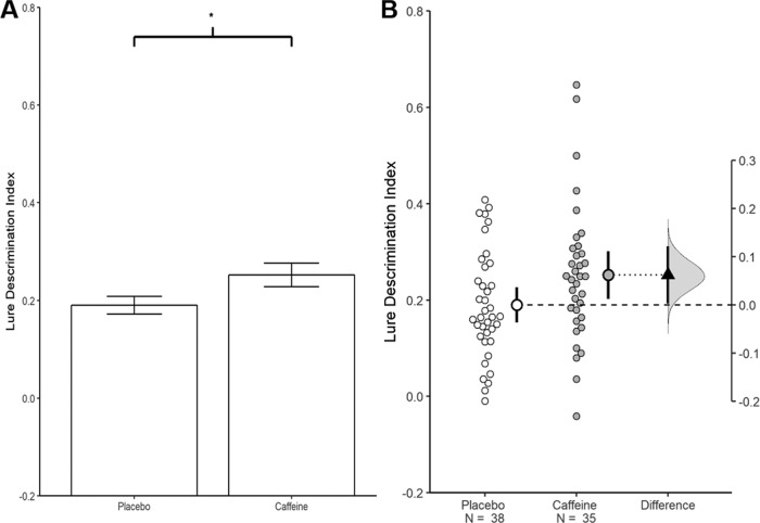
Figure 1.
Visualizations emphasizing testing versus estimation. Both plots are from the same experiment examining the effect of caffeine on memory (Borota et al., 2014). A, A traditional bar graph. The bars represent each group mean; the error bars represent the SEM. The * indicates a statistically significant difference, p = 0.05. B, An estimation plot of the same data. In this plot the small circles represent the individual participants. The large circles with error bars represent each group mean with their 95% confidence intervals. Critically, an estimation plot emphasizes the effect size of interest for this design: the difference between the group means. This is depicted on the “difference axis” on the right. The 0 point of this axis is based on the mean of a reference group (in this case the placebo group). The filled triangle shows the difference between groups in this sample. The shaded curve shows the entire distribution of expected sampling error for the difference between the means. The error bar on the triangle indicates the 95% confidence interval for the difference between means. The confidence interval represents the range of parameter values which remain compatible with the data; that is, the variety of effect sizes that are not rejected at α = 0.05. The range of compatible values is very long and includes values that would be impossible to reliably detect with feasible sample sizes. Given this, research conclusions should be tentative and expectations for replication should be tempered. This difference plot was generated using R. The data from A and B was extracted from Borota et al. (2014).

