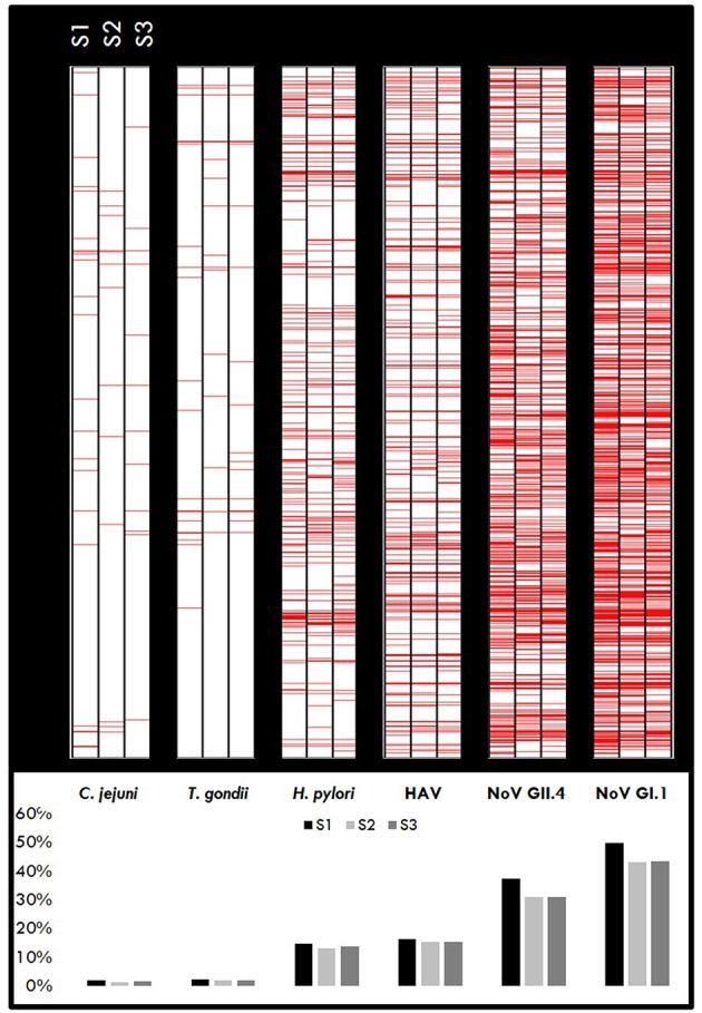
Figure 2.

Immunopositivity heatmaps showing MFI response by pathogen for individuals who gave all three samples (n = 1,399). Upper panel: Red lines represent positive samples (≥ cut-off) for S1, S2, and S3 samples for each pathogen. The darker areas indicate a higher number of positive samples. Lower panel: Percentage of samples positive for each pathogen.
