
Figure 1: Prevalence of delirium phenotypes according to study day.
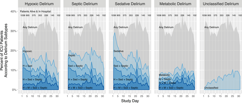
Each area plot shows (on the y-axis) the percentage of study participants in the hospital who had any delirium, a single delirium phenotype, or a combination of multiple delirium phenotypes according to study day (shown on the x-axis). The grey shading indicates the overall percentage of participants with delirium on each study day. The red lines and shaded areas represent the number of phenotypes of delirium present, with darker reds representing the presence of more phenotypes of delirium. The lightest red regions, therefore, show the percentage of participants with a given single phenotype. H=hypoxic. M=metabolic. Sed=sedative. Sep=septic.