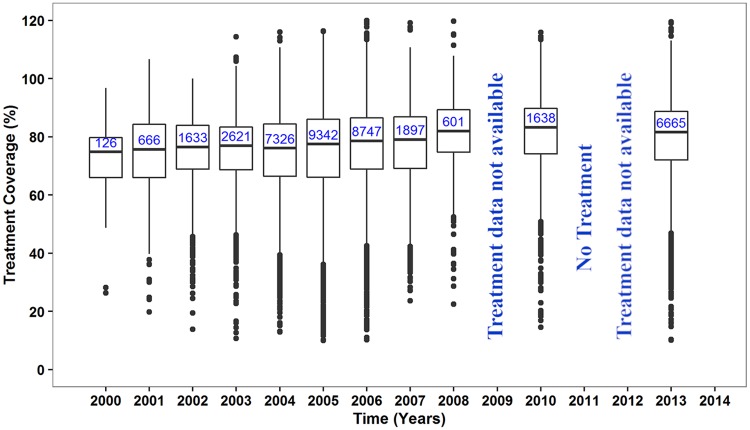
Fig 3. Reported treatment coverage in treated communities in Ghana.
The box at each time point represents the interquartile range of coverage and the thick horizontal lines across each box represent the median coverage. The bullets outside each box (above or below) represent the outliers and are calculated as 1.5 times the interquartile range above or below the ends of the box (25th and 75th percentile). The vertical lines (whiskers) extend to the first value (coverage) before the outlier cut-off and where there are no outliers, they represent the minimum and maximum coverage at each time point. The numbers in the boxes are the total number of communities treated at each time point. There was no treatment offered in 2011 due to some challenges; 2009 and 2012 treatment data not available.

