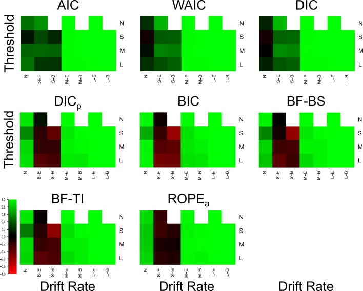
Fig. 4.
Plots of the Brier score of correct selections for the drift rate effect for each model selection method (different plots) for the 25 different cells of the design (rows and columns). Lighter shades of green indicate better performance, lighter shades of red indicate worse performance, and black indicates intermediate performance, which can be seen in the color bar to the left-hand side. White indicates cells that did not exist in the simulated design. Different cells display different data-generating models, with the different columns being different generated drift rates, and the different rows being different generated thresholds. For rows and columns, ‘n refers to no effect, ‘S’ refers to a small effect, ‘M’ refers to a moderate effect, and ‘L’ refers to a large effect. When both effects are present (i.e., not ‘N’), ‘E’ refers to an extreme difference between conditions, whereas ‘n refers to a balanced difference between conditions

