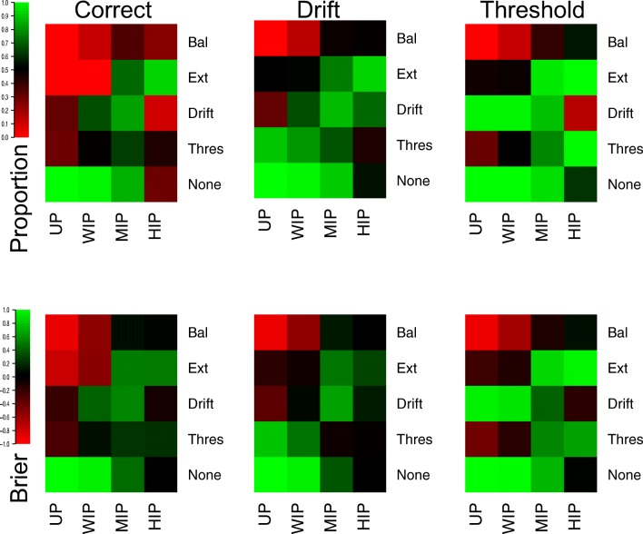
Fig. 8.
Plots of the correct (left panels), drift (middle panels), and threshold (right panels) selections, as proportions (top panels) and average Brier scores (bottom panels). Lighter shades of green indicate better performance, lighter shades of red indicate worse performance, and black indicates intermediate performance, which can be seen in the color bar to the left-hand side. Different rows of cells display different data-generating models, and different columns display different priors

