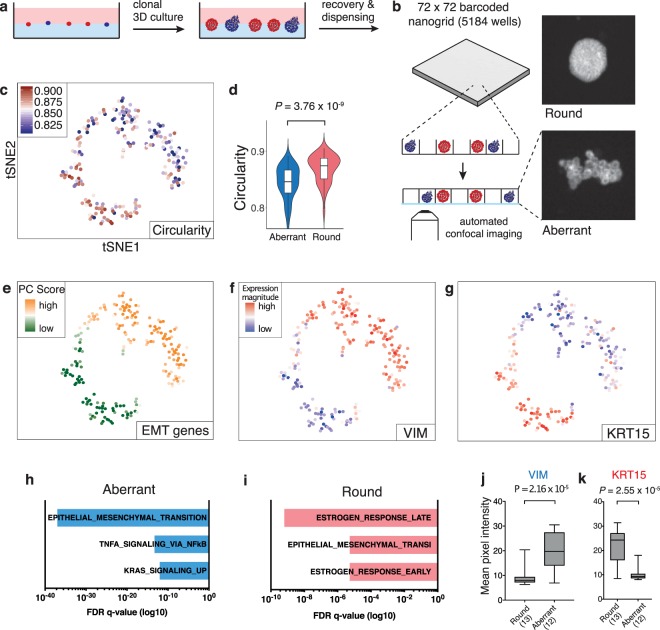
Figure 1.
Pheno-seq directly links visual phenotypes and gene expression in 3D culture systems at high-throughput. (a) Workflow overview for the culture and recovery of clonal spheroids for inference of morphology-specific gene expression. (b) Pheno-seq workflow based on automated dispensing and confocal imaging of recovered spheroids stained by CellTrackerRed in barcoded nanowells. (c) 2D tSNE visualization of 210 pheno-seq 3′-end RNA-seq profiles with coloring based on image feature ‘circularity’. For better visualization, all circularity values below 0.8 were set to minimum in the color code scheme. (d) Spheroid circularity plotted per cluster (k-means clustering, k = 2) as shown in (c). Violin-plot center-line: median; box limits: first and third quartile; whiskers: ±1.5 IQR. Indicated P-value from unpaired two-tailed Students t-test. (e) Same 2D tSNE visualization as shown in (c) with coloring based on PAGODA’s PC scores for HALLMARK_EMT gene set derived from the Molecular Signature Database (MSigDB)38. (f,g) Same 2D tSNE visualization as shown in (c) with coloring based on expression magnitude for EMT marker VIM (f) and epithelial marker KRT15 (g). (h,i) Gene set enrichment analysis based on Hallmark gene sets35 for ‘aberrant’ (h) and ‘round’ (i) phenotype specific genes identified by differential expression analysis37 derived from the MSigDB. Bar plots show top three enriched gene sets ranked by FDR q-values. Example genes are VIM, TGFA, FAP for ‘aberrant’ and KRT15, CA2 and KRT16 for ‘round’ phenotypes. (j,k) Validation of phenotype-specific expression for VIM (aberrant) and KRT15 (round) by whole mount immunofluorescence (IF). Plotted values reflect mean pixel intensity per classified spheroid. Box plot center-line: median; box limits: first and third quartile; whiskers: min/max values. Numbers of samples indicated on x-axis under respective phenotype class. Indicated are P-values from unpaired two-tailed Students t-test.

