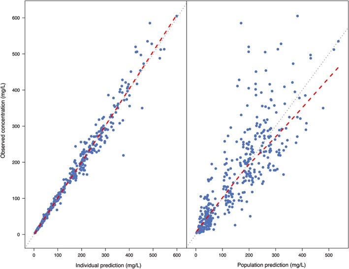
Figure 3.

Goodness‐of‐fit plots for the final pharmacokinetic model. Left: individual‐predicted concentrations vs observed concentrations. Right: population‐predicted concentrations vs observed concentrations. Blue dots represent the observations and the red dashed line is a local regression fit of these values. Grey dashed line is the line of unity
