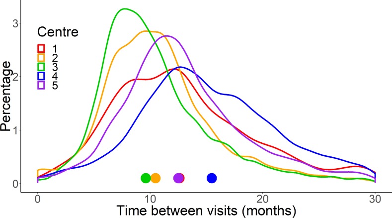
Figure 3.
A plot showing the distributions of the time interval between patient visits (in months) in each of the five centres. Each line represents one of the centres. Centre 4 is more positively skewed, indicating a higher proportion of patients with longer intervals between visits. The coloured symbols indicate the median time interval between visits for each centre (see table 2).

