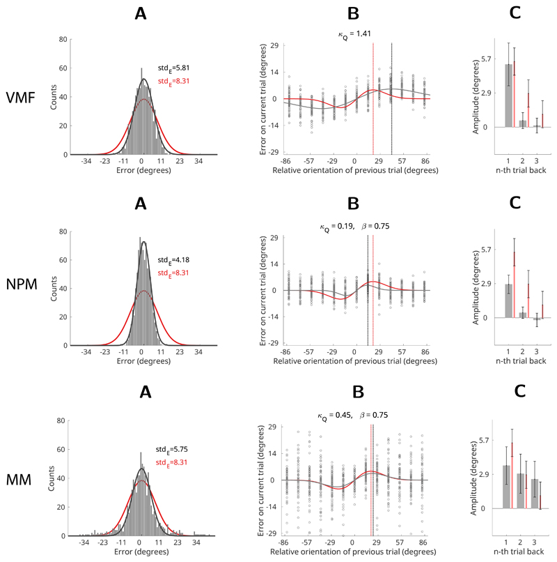
Figure 8. Results.
Comparison of model simulation results (black) with human data from Experiment 1 (red, Fischer & Whitney, 2014). (A) Error histograms: black – model simulation, red – average human participant. Solid lines depict Von Mises fits to error distributions. (B) Recency bias: black circles show errors of the simulated responses. Solid black line shows a DoG curve fit to the simulated errors, red line shows the human recency bias (average DoG fit to human errors). Dotted vertical lines show the location of the maxima of the recency biases (black – model; red – human participants). (C) Average recency bias amplitude computed for stimuli presented one, two and three trials back from the present. Grey bars – model; red bars – human participants. Error bars represent ±1 standard deviation of the bootstrapped distribution.

