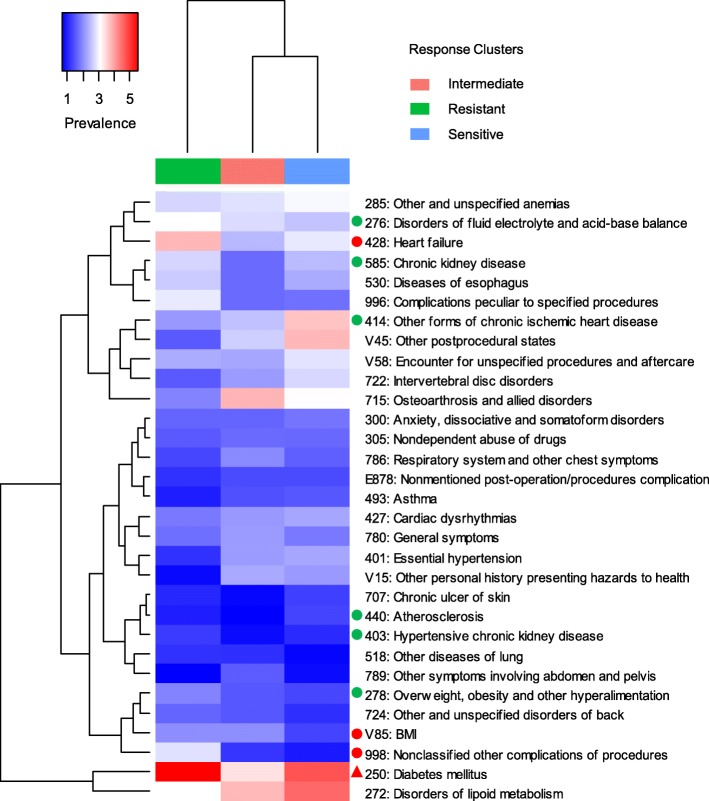
Fig. 3.
Heatmap of comorbidity prevalence in the three subgroups identified by k-means clustering. X-axis represents the subgroups; Y-axis represents the comorbidities. Hierarchical clustering was performed on both X- and Y-axis using Euclidean distance and average linkage method. The redder, the higher prevalence. The greener, the lower prevalence. The prevalence of disease across the subgroups was evaluated by chi-square test. The red triangle represents P < 0.001; the red dot represents P < 0.01; the green dot represents P < 0.05

