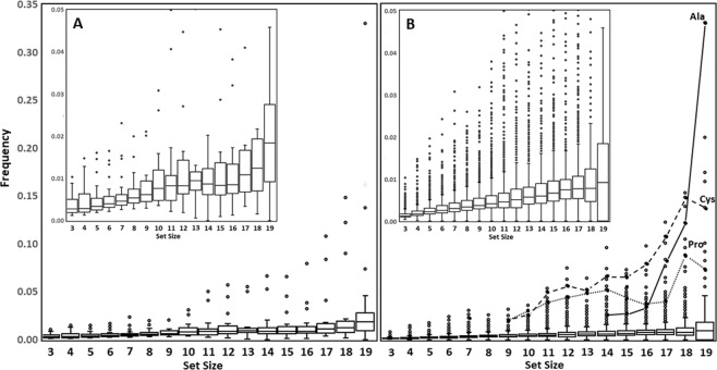
Figure 2.
Box plots showing the relative frequency of (A) CAAs and (B) XAAs in better sets. Boxes extend from the lower to upper quartile values of the data, with a line at the median, and whiskers extending to contain 95% of the data. Zoomed insets help to show that the comparison of (A,B) reveals that the median values for maximal CAA sets are always higher than those of the corresponding XAA set sizes. In (A) all top outlier data points represent Met in set sizes 16–19. The connected data points in Figure B highlight the anomalously high frequency of the CAAs, Ala, Cys and Pro, in better XAA sets of larger set size.

