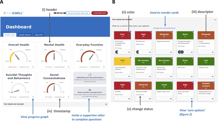
Figure 1.
The dashboard of results for the Innowell Platform. Panel (A) shows the summary dashboard which provides a broad overview of the young person’s results for key health domains. Panel (B) shows the more detailed dashboard (i.e., “your results and care plan” section expanded), whereby all of the results from the broad assessment are displayed on different “health cards.” Each domain is accompanied by a scale, the current result (represented using color and a dial), and an indication of personalized change. The Platform allows for the customization of specific domains, questions, and algorithms for this section. The use of color here is to make it easier for young people and clinicians to figure out what might be tracking well or not so well. The color is accompanied by a text description (e.g., high) as well as a timing (e.g., 3M, equal to “3 months”), which is used to indicate how recent the current result is. The middle of the health card presents the title and includes the personalized change status in text (e.g., improvement). The circles presented on the “suicidal thoughts and behaviors” health card provides an example of how the Platform communicates whether or not an intervention is currently active for a particular domain. Here, the initials of the treating clinician are displayed along with the young persons initials to indicate they are working on this together. Gray text and arrows highlight key components described the feedback section of this paper; blue text and arrows highlight other key components. Please note that the image presented here displays the Platform as it exists at the date of this publication, and is subject to further development and refinement.

