. 2019 Aug 8;16:E102. doi: 10.5888/pcd16.180498

Figure 1.

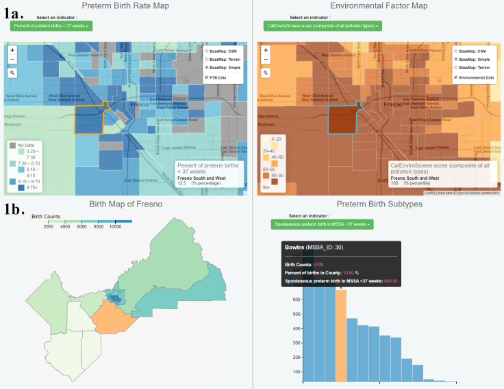
The figure depicts 2 examples of data visualizations for the front-end site of the preterm birth visualization tool. The first displays two maps side by side. Each map shows the same census tract boundaries for an area of the city of Fresno. The map on the left depicts preterm birth rates. Data were unavailable for some census tracts. The map on the right depicts the total pollution score from the CalEnviroScreen pollution tool. The area encompassed by this figure has overall high pollution rates and moderate-to-high preterm birth rates. One specific census tract is highlighted in both maps demonstrating the map linkage capability of the tool. The second data visualization has 2 boxes. On the left it depicts all of Fresno County using Medical Service Study Area (MSSA) geographical units to show preterm birth rates throughout the county. On the right a histogram shows spontaneous preterm birth rates for each MSSA included in the map. The bar with the highest rate of spontaneous preterm birth is highlighted, and the corresponding MSSA is highlighted on the map on the left. A popup box gives further information about that MSSA with specific values of preterm birth and spontaneous preterm birth.

A. Demonstration of the environmental pollution topic of an online geographic data visualization tool for exploring preterm birth in Fresno County, California, using linked maps. Different indicators can be selected for each map. B. The birth topic with overall preterm birth shown on the map and spontaneous preterm birth shown on the indicator histogram. Data elements are linked so that as selection of 1 data value occurs, the location of that data value is displayed on the map.