. 2019 Aug 8;16:E102. doi: 10.5888/pcd16.180498

Figure 2.

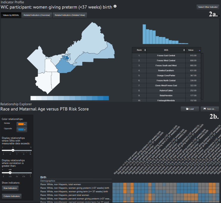
The figure depicts 2 examples of data visualizations for the back-end site of the preterm birth visualization tool. In the top figure the indicator explorer feature is demonstrated showing a map of Fresno County on the left and a histogram on the right of a selected indicator, women who gave birth preterm (<37 weeks) and used WIC. Values in numbers for each MSSA are shown on the map on the left, and the histogram on the right depicts the same values in graphical format. The highest value is shown to be Fresno East Central with a value of 915. This MSSA is also highlighted on the map. The bottom figure shows the relationship explorer tab, which generates a correlation matrix visualized as a heat map for selected indicator values. Indicators related to risk score for preterm birth and race are shown. The heat map shows high positive correlation values and high negative correlation values. The map includes controls on the left of the screen for changing the correlations, the number of MSSAs included in the analysis, and the minimum correlation value to be included in the heat map.

A. Demonstration of the indicator explorer feature of an online geographic data visualization tool to explore preterm birth in Fresno County, California. The indicator explorer feature allows mapping and side-by-side histogram evaluation of any of the hundreds of variables included in the back-end site. As one variable is selected, the relationship between that indicator and others can be viewed in alternate tabs. B. The relationship explorer tab, which builds correlation matrixes for selected indicators. Users can change color, specify the minimum number of geographical units that must be included, and specify the minimum correlation value.