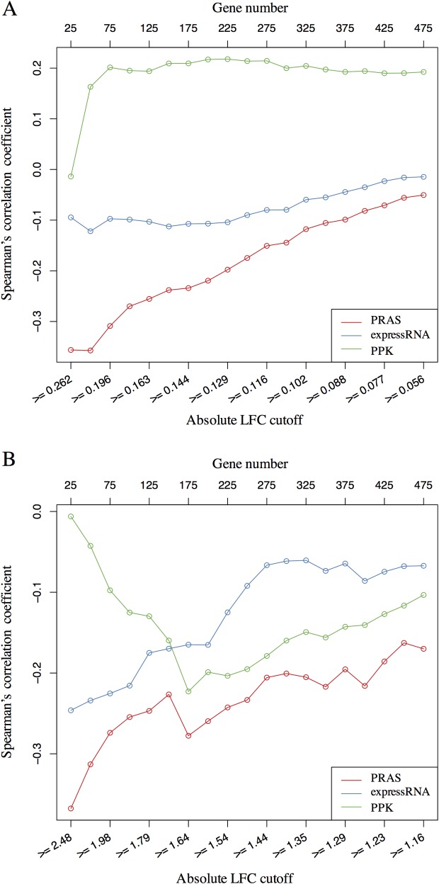
Fig 4. Correlation analysis between PRAS score and gene expression change.
(A) The line-chart of Spearman’s correlation coefficient between the gene score and the gene expression LFC in the Celf4-regulated list. The lower X-axis represents the different cutoffs applied to extract the subset of genes, the upper X-axis represents the number of genes corresponding to the applied cutoffs, and the Y-axis shows the value of Spearman’s correlation coefficient. The corresponding curves for PRAS, expressRNA, and PPK are indicated by red, blue, and green lines, respectively. Each dot in the plot is for one subset of genes selected based on the absolute LFC cutoff. (B) Similar line-chart to A, but for the Celf1-regulated list. These two line-charts show that the higher ranked targets by PRAS have higher enrichment in the regulated lists comparing to the top ranked lists of expressRNA and PPK.

