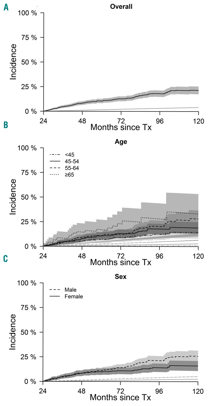
Figure 2.
Mortality in myelofibrosis compared to the general population. (Top) Plots show mortality of the disease-free survivors (black line) and of the general population (gray line). (Middle) Plots show mortality of the myelofibrosis patients according to sex (black solid line: female; dashed line: male) and mortality in the general population (gray lines). (Bottom) Plots show mortality of disease-free survivors (black lines) and general population (gray lines) according to age categories. Tx: transplantation.

