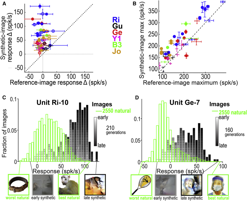
Figure 5. Evolutions for other IT cells.
(A) Change in response to synthetic vs reference images over generations. Each point shows the mean change in firing rate to reference versus synthetic images in each experiment (change estimated by the amplitude coefficient of an exponential function fitted to the neuron’s mean response per generation; error bars = ±sem, per bootstrap, 500 iterations of data re-sampling). Solid circles indicate single units; open circles multi-units. (B) Scatter plot of maximum responses across all images for synthetic vs reference images (measured across all generations, max±SE per bootstrap). Colors indicate animal. The size of the circle indicates statistical significance (large circle: P < 0.03 after false discovery correction). Black square indicates the experiment in Figure 3. (C) Histogram of response magnitudes to natural (green) and synthetic (gray-to-black) images for unit Ri-10 (same unit as Figures 3&4). Below the histogram are shown the best and worst natural and synthetic images. (D) Same for unit Ge-7. The evolution for this neuron can be seen in Video S1.

