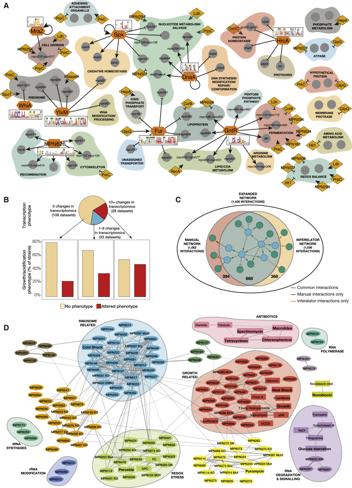
Figure 3.
Classification of the Candidates and DNA Motifs Using the Phenotypic Analyses
(A) The sequence motifs for 9 TFs analyzed in this study (in orange hexagons), as well as their main regulated targets (arrows indicate activation and crosses repression) are shown. We also show the proteins identified as regulators in this study (orange diamonds) and the functional category of the genes they significantly affected (if a regulator affects a single gene in a functional category, we do not show it; see Table S5).
(B) M. pneumoniae phenotypes. Experiments were classified into three groups according to the number of identified transcriptional changes that they displayed. For each group, bar charts show the percentage of genes that display a growth curve phenotype (faster or slower growth and/or medium acidification) with respect to the total.
(C) Inferelator results on the genetic perturbations. The Venn diagram depicts the interactions retrieved manually, those found using Inferelator, and those common to both methods.
(D) Network of the transcriptional phenotypes induced by OE, KO and/or mutants of all genes selected in this study, as well as by environmental perturbations. Lines represent correlations between the experiments above 0.45. Colors represent different clusters of highly interconnected experiments. Clusters enriched in different functional categories are represented in shaded circles. Perturbations are shown in square boxes and overexpressed, mutated or deleted genes in ovals. The sign of fresh medium addition was reversed for visualization in the growth-associated cluster (with which it correlates negatively).

