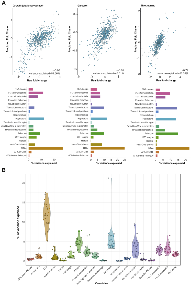
Figure 5.
Variance Explained in Experimental Perturbations
(A) The upper panel shows correlation plots between the predicted and the experimental fold changes for three different perturbations: entry into stationary phase, glycerol, and thioguanine addition. The lower panel shows the variance explained by each canonical or alternative mechanism for these experiments.
(B) The violin plots show, for each experiment, how much variance (in %) can be explained by each regulatory mechanism. The total variance explained in the entire dataset (not accounting for noise) is 45%.

