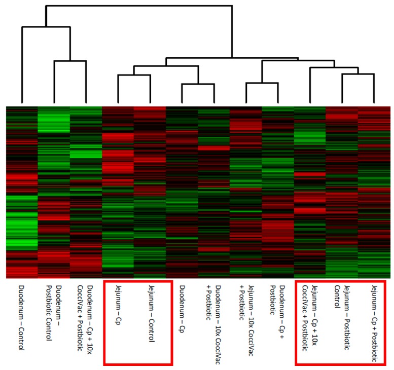
Figure 1.
Heatmap and Clustering of Kinome Profiles. The raw kinome signal from the peptide array was input into the custom software package PIIKA 2. PIIKA 2 combines the biological replicates for each treatment and tissue, normalizes the data, and generates a representative kinome profile. Here, the profiles are compared for relative similarity, and a heatmap shows the relative phosphorylation of each peptide on the array. Cp = C. perfringens.

