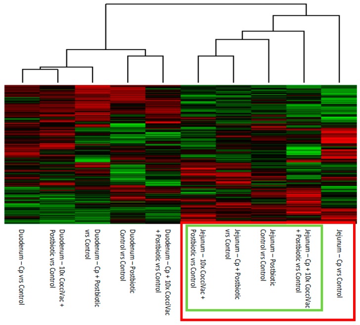
Figure 2.
Heatmap and Clustering of Treatment Kinome Profiles Relative to Control Kinome Profiles. The raw kinome signal from the peptide array was input into the custom software package PIIKA 2. PIIKA 2 combines the biological replicates for each treatment and tissue, normalizes the data, and generates a representative kinome profile. Here, the profiles for each treatment group are compared to the kinome profile of control groups. The resulting kinome profiles are then compared for relative similarity, and a heatmap shows the relative phosphorylation of each peptide on the array for a given treatment group relative to control. Cp = C. perfringens.

