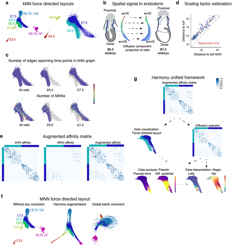
Extended Data Figure 3: MNN augmentation to correct batch effects between time-points and Harmony unified framework for scRNA-seq data analysis.
a, Force directed layouts for cells of the following time-points: E3.5, E4.5, E5.5, E6.5, E7.5 and E8.75 (amalgamation of anterior and posterior gut tube halves). Cells are colored by time-point. The graph was generated using an adjacency matrix derived from the standard kNN graph. Differences between consecutive time-points represent underlying developmental changes but are also confounded by technical batch effects, including discontinuity between E3.5 and E.4.5 and lack of spatial alignment between E6.5 and E7.5. b, E6.5 and E7.5 cells projected along their respective first two diffusion components. These projections reveal a dominant first component with strong spatial signal within individual time-points. Cells are colored by Phenograph clusters. c, The number of edges connecting cells between time-points are limited in the kNN graph (Top panel). Bottom panel: Plots showing the number of mutually nearest neighbors (MNNs) between E6.5 and E7.5 time-points. The MNNs are enriched along the boundary between time-points, supporting augmentation of the kNN graph with additional edges between mutually nearest neighbors (MNNs) between the consecutive time-points. d, The MNN distances can be converted to affinities on a similar scale as the kNN affinities, using linear regression to determine the relationship between the kath kNN and kath MNN distances. e, Example of the augmented MNN affinity matrix construction. Left panel: kNN affinities for a subset of E6.5 and E7.5 cells. Middle panel: MNN affinity matrix constructed using linear regression (d) to convert distances E6.5 and E7.5 cells to affinities. Right panel: Augmented affinity matrix: Sum of the kNN and MNN affinity matrices. f, Comparison of force directed layouts. Left: Standard kNN affinity matrix, Middle: Harmony’s augmented affinity matrix. Right: Plot generated using mnnCorrect27 for global batch effect correction leading to “over-correction” and loss in signal between time-points. g, Harmony framework starts with the augmented affinity matrix generated as described in supplemental methods. The augmented affinity matrix is used to generate the force directed graph for visualizing the data. The same augmented matrix is used to compute the diffusion operator for determining the diffusion components which, (a) forms the basis for Palantir trajectory detection, and (b) MAGIC imputation. h, Robustness of Harmony: Plots showing the correlation between diffusion components for different values of k, the number of nearest neighbours for kNN graph construction. VE cells in Fig.4 were used for testing robustness. i, Harmony applied to replicates: Plots showing the Pearson correlation between diffusion components without Harmony (x-axis) and with Harmony applied between the two replicates of the E8.75 gut tube. Plots shown for 3512 cells.

