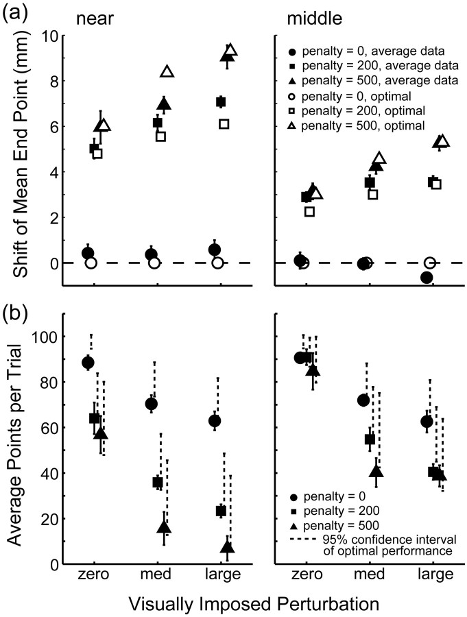
Figure 5.
Comparison of average subject data with the optimal performance model. a, Horizontal shift of actual end points from the center of the target away from the penalty averaged across subjects as a function of added perturbation for the near (left) and middle (right) conditions. The filled triangles, squares, and circles represent recorded shifts when the penalty value was 500, 200, and 0, respectively. Open symbols indicate shifts as predicted for an optimal movement planner (with averaged movement variability). The shift is larger with larger penalty, larger perturbation, and closer penalty region. b, Points scored averaged across subjects. Average points per trial are plotted as a function of added perturbation for the near (left) and middle (right) conditions. Dashed lines indicate the corresponding 95% confidence interval of optimal performance. Performance drops with larger penalty, larger perturbation, and closer penalty region. Error bars indicate SEM for averaging across the six subjects.

