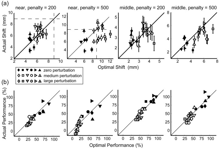
Figure 6.
Comparisons of observed and optimal shifts and performance for individual subjects. Data are displayed for the near and middle conditions for penalty values of 200 and 500. a, Horizontal shift of mean end points from target center plotted against the optimal shift predicted by our model. Model predictions were computed based on each subject's variance. Diagonal lines represent perfect correspondence of observed and predicted optimal end points. Vertical and horizontal dashed lines indicate the position of the edge of the target circle. Symbol color represents different amounts of perturbation (black, zero perturbation; white, medium perturbation; gray, large perturbation). Different symbols represent data from different subjects (from left to right: AAM, CAL, JJT, MID, SSG, and VVF). Error bars indicate SEM. b, Average number of points earned per trial plotted against optimal number of points per trial as predicted by our model. Model predictions were computed based on each subject's variance.

