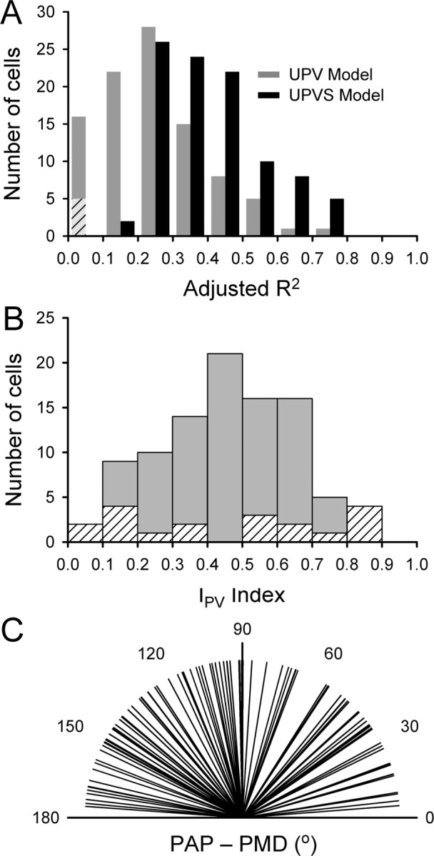
Figure 8.

Population results for the UPVS model. A, Comparison of adjusted R2 values for UPV (gray bars) and UPVS (black bars) models. The bars represent the number of cells with an appropriate value of adjusted R2. Diagonal stripes denote cells for which the UPV model fit was not significant. B, Histogram of the position-velocity contribution index Ipv. Diagonal stripes represent cells for which either unit position or unit velocity term was not significant, so that the Ipv is not reliable. C, Distribution of the differences between PAP and PMD.
