
Figure 6. DNA–RNA hybrid accumulation in different phases of the cell cycle.
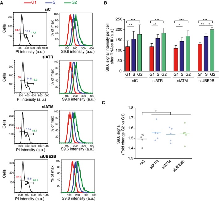
- Left column: flow cytometry profiles showing DNA content of the indicated RNase III‐treated cells. G1 (red), S (blue), and G2 (green) phases were calculated from the profile. Right column: flow cytometry histograms depicting intensity of S9.6 signals in each phase of the cell cycle for the indicated cells.
- Quantification of panel (A). The mean ± SD of the S9.6 mean intensity of five experiments is shown. ***P < 0.001, **P < 0.01, *P < 0.05 (repeated measures ANOVA test with Bonferroni's post‐test).
- Graph represents fold change of S9.6 mean signal in G2 with respect to G1 cells. Values for five independent experiments together with the mean are shown. *P < 0.05 (one‐tailed paired t‐test).