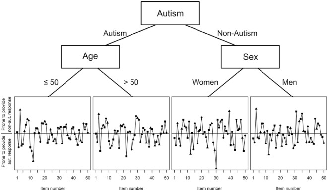
Figure 2.
Rasch regression tree. In the bottom plots, the normalized item difficulties are plotted for the different groups. The higher a particular point is, the more prone a person within that subgroup is to provide a response that is not typical of autism; the lower a particular point is, the more prone a person within that subgroup is to provide a response that is typical of autism, given equal values on autistic traits. The different symbols (square, circle, and triangle) do not have separate meanings, but were chosen so the points can be easily distinguished and the position can be compared between the four different subgroups.

