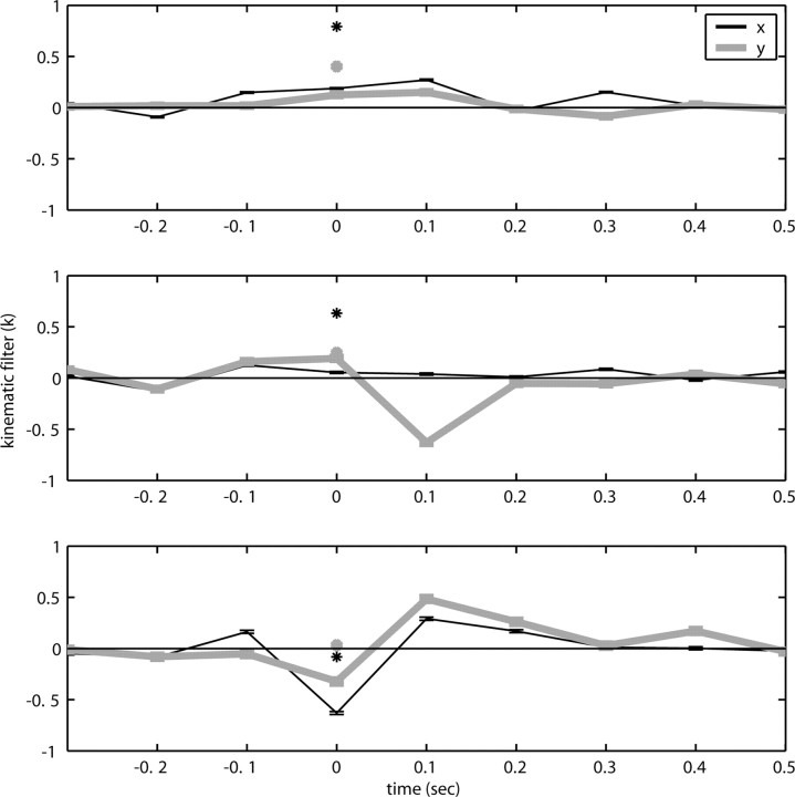
Figure 2.
Diversity of estimated preferred trajectories  . Example preferred trajectories
  , estimated for three different cells. Asterisk indicates contribution of position (in centimeters) at zero time lag, and solid line gives contribution of velocity (in centimeters per second) at the different time lags shown; error bars represent SE. (For why this representation of the preferred trajectory
  was chosen, see Materials and Methods.)

