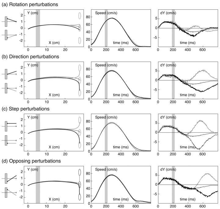
Figure 3.
Mean trajectories and kinematic data for a representative subject from experiment 1. The four sets of graphs (a–d) correspond to the four types of perturbations. Each graph plots three data series, corresponding to mean data from trials with positive perturbations (black lines), negative perturbations (gray lines), or no perturbations (thin lines). Before averaging across trials, the raw finger position data were normalized with respect to target direction and projected onto the tabletop (i.e., ignoring height from the table). The left graphs plot mean trajectories of the fingertip in x–y space on the tabletop. The three dashed circles on the graphs show the range of positions for the actual unseen fingertip that would successfully have brought the virtual fingertip to the target. Middle graphs plot (unsmoothed) finger speed as a function of time. Right graphs plot the y component of finger velocity as a function of time. The shaded regions depict when the virtual finger was hidden from view behind the occluder.

