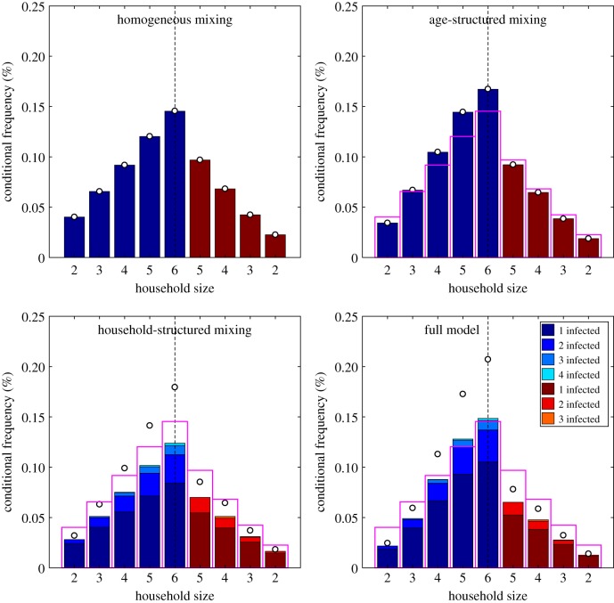
Figure 3.
Percentage distribution of cases per household conditional on the size and age of the household, under the four different transmission models. These results are for a mumps-like infection in a UK-like population. For purposes of clarity, we do not plot the percentage of disease-free households since this is several orders of magnitude larger than the other percentages combined. As in figure 2, blue bars correspond to younger households (the first two rows in figure 1) and red to older households (the second two rows in figure 1). The pink open bars correspond to the results from the homogeneous mixing model, which are shown for ease of comparison; the open circles show the total amount of infection in the households accounting for multiple infections.

