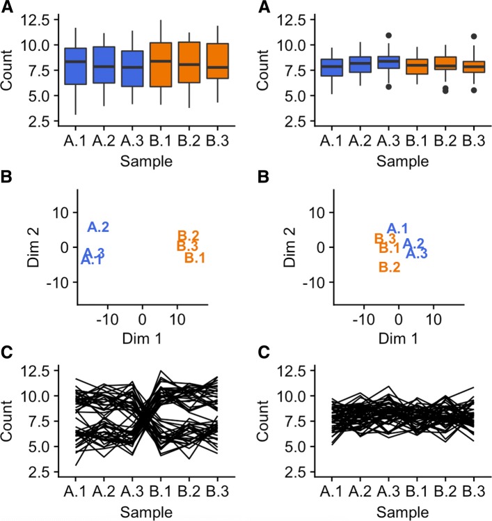
Fig. 1.
Comparison of plotting methods using simulated data. One simulated dataset is shown on the left half and another simulated dataset is shown on the right half of the figure. The parallel coordinate plots (subplots C) show a critical difference at the gene-level between the datasets. Namely, the left dataset is composed of genes with small replicate variation and large treatment group variation (suggesting DEGs), while the right dataset is composed of genes with similar variation between replicates and treatment groups (not suggesting DEGs). We cannot see this gene-level difference with the boxplots and MDS plots

