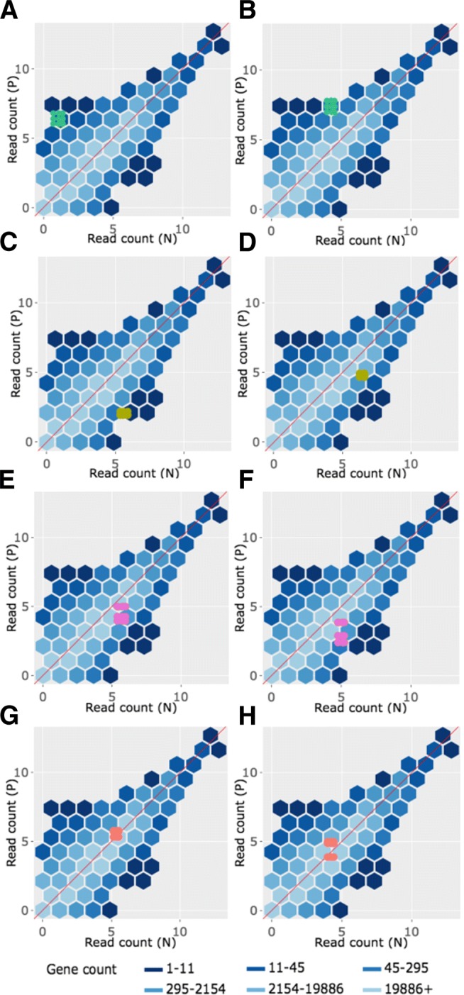
Fig. 10.

Example litre plots for clustered significant genes in the soybean iron metabolism data. Litre plots for representative genes from clusters created in Fig. 2 [24]. Subplots a and b each show a gene from Cluster 1 overlaid as green points. Subplots c and d each show a gene from Cluster 2 overlaid as dark yellow points. Subplots e and f each show a gene from Cluster 3 overlaid as pink points. Subplots g and h each show a gene from Cluster 4 overlaid as orange points
