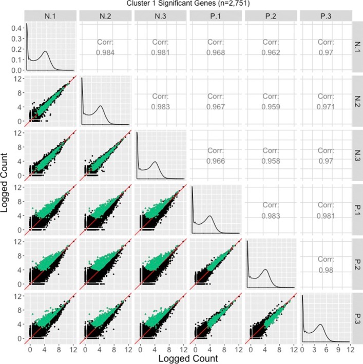
Fig. 11.
Cluster 1 significant genes from the soybean iron metabolism data overlaid on a scatterplot matrix. Example of using a scatterplot matrix to assess DEG calls from a model in the iron-metabolism soybean dataset. There were 2751 significant genes in Cluster 1 after performing a hierarchical clustering analysis with a cluster size of four (Fig. 2). These significant genes are overlaid in green on the scatterplot matrix. They follow the expected patterns of differential expression with most green points falling along the x=y line in the scatterplots between replicates, but deviating from the x=y line in the scatterplots between treatments. The deviation consistently demonstrates higher expression in the P group than in the N group. Hence, these green points seem to represent DEGs that were significantly overexpressed in the P group, which draws the same conclusion with what we derived using the parallel coordinate plots in Fig. 2. One difficulty with plotting such a large number of DEGs onto the scatterplot matrix is that overplotting can obscure our inability to determine how many DEGs are in a given location. This is why we should also view these genes individually in litre plots (Fig. 10a and b)

