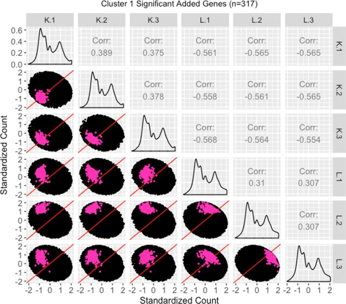
Fig. 24.

Standardized scatterplot matrix for gene cluster that were added as liver-specific DEGs after TMM normalization. Scatterplot matrix of the standardized 317 genes that were in the first cluster (Fig. 20) from genes that were added as liver-specific DEGs after TMM normalization. Even though the standardization process removes the interesting geometrical features we would otherwise see, it amplifies DEG patterns in meaningful ways. Namely, the genes of interest are now spread out more, and we can now distinguish the replicate and treatment scatterplots more clearly. For the most part, the genes of interest deviate from the x=y line in the treatment scatterplots more so than in the replicate scatterplots, and hence display somewhat of the pattern of differential expression. In fact, the pink genes again appear as an intermediate between the purple and orange genes that clearly display differential expression (Figs. 21 and 22) and the red genes that clearly do not display differential expression (Fig. 23). In other words, standardized scatterplot matrices provide additional visualization evidence that TMM normalization was justified in removing the red genes from and adding the pink genes to DEG designation
