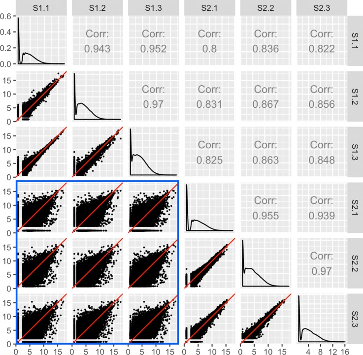
Fig. 3.
Expected structure of RNA-seq data plotted as a scatterplot matrix. Example of the expected structure of an RNA-seq dataset, using soybean cotyledon data from [27]. Within a given scatterplot, most genes (points) should fall along the x=y line. We should see genes deviate more strongly from the x=y line in treatment scatterplots (the nine scatterplots enclosed in the blue square) than in replicate scatterplots (the remaining six scatterplots)

