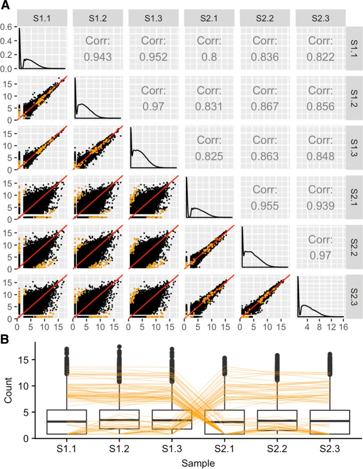
Fig. 9.
Assessing differential expression in RNA-seq data using scatterplot matrices. Example of the expected structure of DEG calls (in orange) from the soybean cotyledon dataset [27]. In the scatterplot matrix (subplot A), DEGs should fall along the x=y line for replicates and deviate from it for treatments. In the parallel coordinate plot (subplot B), DEGs should show levelness between replicates and crosses between treatments. These two plotting types can be linked to quickly provide users multiple perspectives of their DEG calls

