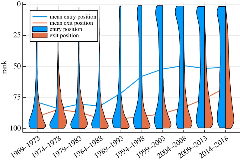
Figure 6.

Entry and exit distributions. For the top 100 Billboard album charts, the distribution of entry (blue) and exit ranks (orange), averaged over five-year periods. The width of the violin charts measures the respective probabilities. Also included are the mean entry and exit positions (lines). Note the dramatic increase in top-ranked entries in the 1990s. The corresponding rise in exit ranks has been more sequential. Checking for different chart lengths, top 40 and top 200, we found a qualitatively similar behaviour that is rescaled according to the chart length considered.
