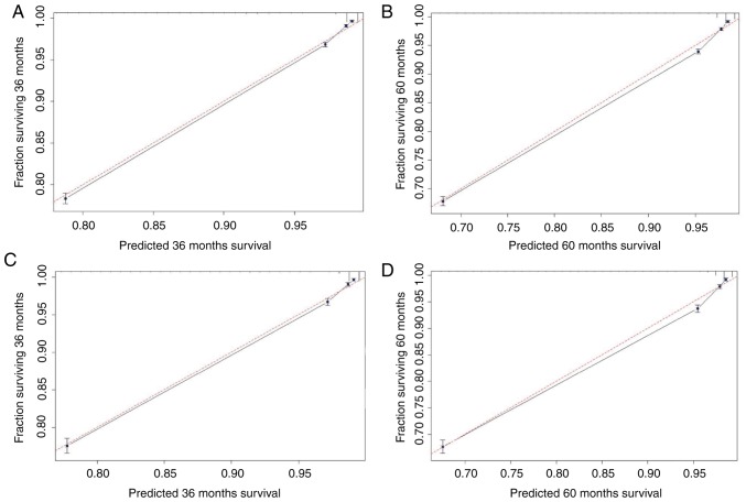
Figure 3.
Calibration curves for the nomogram. The x-axis is the predicted survival calculated by the nomogram, and the y-axis is the actual survival estimated by the Kaplan-Meier method. The 95% confidence intervals of the Kaplan-Meier estimates are indicated by black vertical lines at each point. The red dashed line presents the reference line and is a 45° diagonal. The closer the black line drawn by the model is to the red dashed line, the better the model. (A) Calibration plot of the 3-year OS for the training cohort. (B) Calibration plot of the 5-year OS for the training cohort. (C) Calibration plot of the 3-year OS for the validation cohort. (D) Calibration plot of the 5-year OS for the validation cohort. OS, overall survival.

