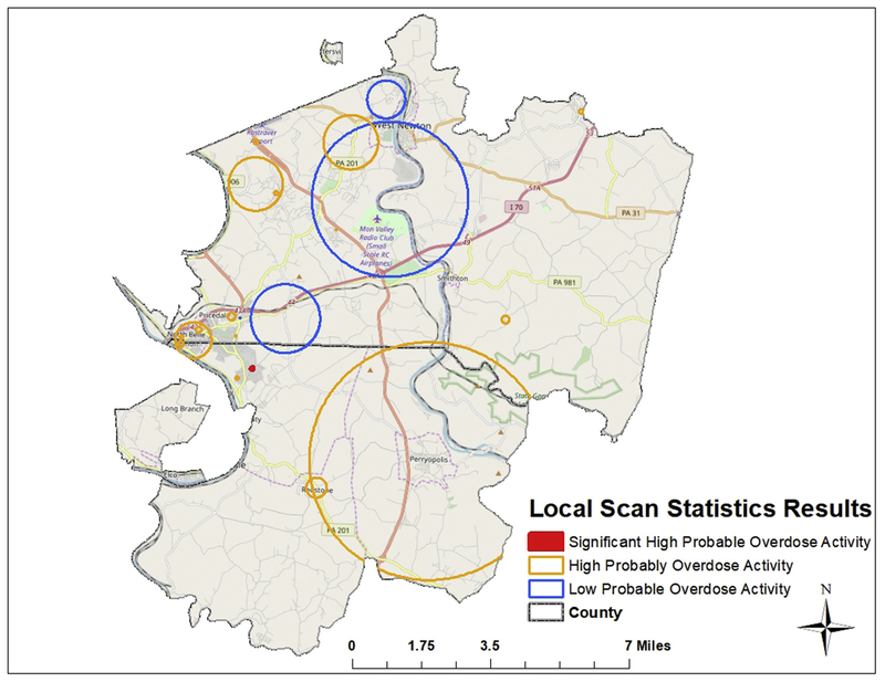
Fig. 3.
Purely spatial Bernoulli model scan statistic results for local clustering. Orange circles indicate areas of high risk, and blue circles display areas of low risk for probable overdose. The red circle represents the statistically significant cluster of high probable overdose risk. (For interpretation of the references to color in this figure legend, the reader is referred to the Web version of this article.)

