Figure 1.

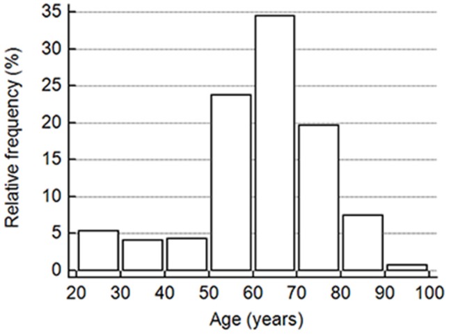
The vertical bar on the y-axis shows the frequency as the percentage in the number of all participants in the cohort, and the x-axis indicates the age groups in 10-year intervals.

The vertical bar on the y-axis shows the frequency as the percentage in the number of all participants in the cohort, and the x-axis indicates the age groups in 10-year intervals.