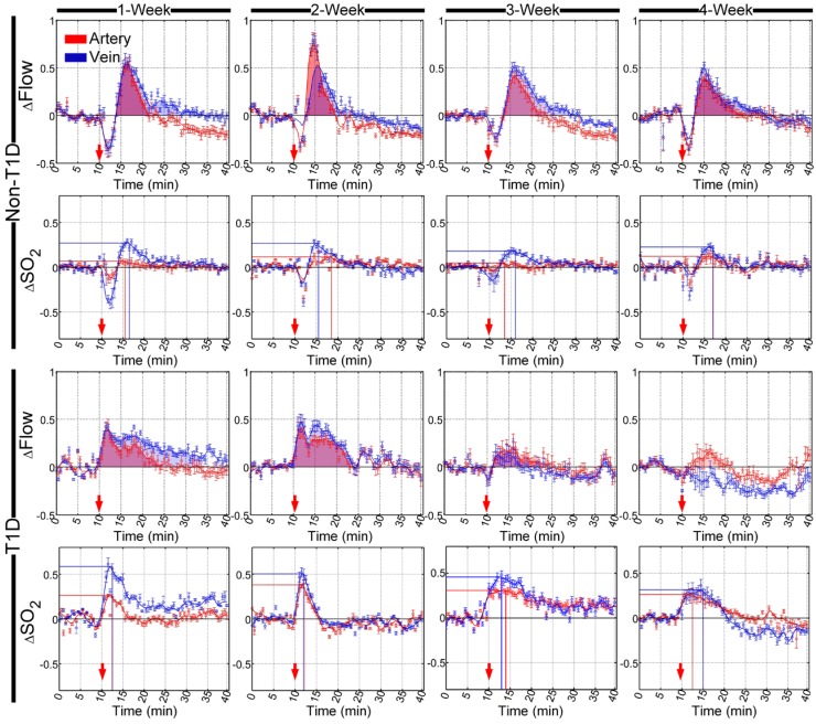
Figure 3.
Time-lapse data showing the relative changes in cerebral vascular blood flow and corresponding blood oxygen saturation that occurred in arteries (red) and veins (blue) after the injection of SNP in different stages of T1D. The red arrows indicate the time of the injection. The shadowed areas indicate the areas under curves of relative changes in blood flow (red and blue represent arteries and veins, respectively). The lines perpendicular to the x- and y- axes represent the position of the maximum value of relative changes in blood oxygen saturation (red and blue lines indicate arteries and veins, respectively) (n=8, mean ± standard error).

