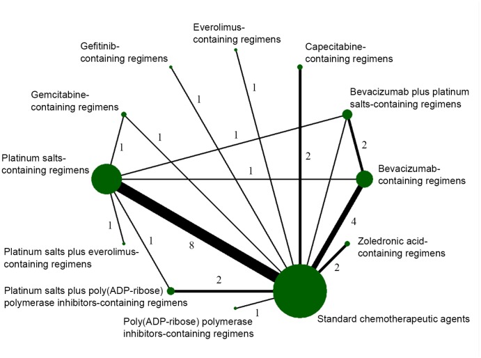
Figure 2.
Network diagram of eligible comparisons included in the network meta-analysis for pathological complete response (pCR). The node size is proportional to the total number of patients in the regimen. The width of each line is proportional to the number of studies comparing the two regimens linked by the line.

