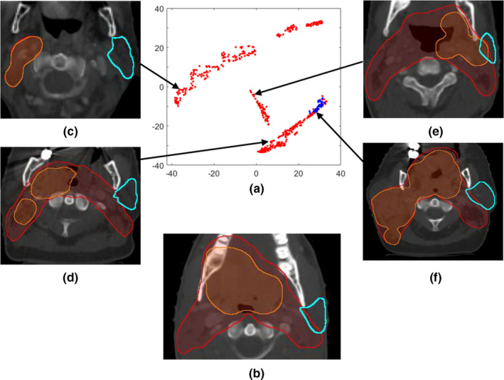
Figure 3.

A t‐SNE visualization example: (a) A two‐dimensional t‐SNE map of the left parotid gDTHs; (b) The randomly selected validation case; (c)–(f) four example cases located in different regions of the feature map. In (a), blue dots mark the cases selected by the similarity metric for modeling the validation case in 3b, and red dots denote the rest of the dataset. (c)–(e) show three unselected cases and the arrows indicate their locations on the t‐SNE map, while (f) is one of the selected cases even though its PTVs (especially boost PTV) are significantly different to 3b in size and location. Both the x‐ and the y‐axis of the t‐SNE map are dimensionless and are of arbitrary units. [Color figure can be viewed at wileyonlinelibrary.com]
