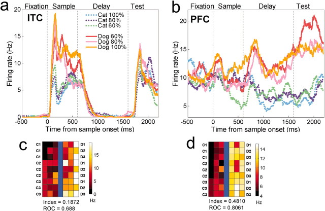
Figure 4.
Single neuron examples. A, The average activity of a category-sensitive ITC neuron to the six levels of morphs. The dotted vertical lines correspond (from left to right) to sample onset, offset, and test stimulus onset. B, A category-sensitive PFC neuron. The color plot below each histogram (C, D) shows the average activity of each neuron to each of the 42 stimuli along the nine between-class morph lines (Fig. 1). The prototypes (C1, C2, C3, D1, D2, D3) are represented in the outermost columns, and the category boundary is represented by the blue line in the middle. Each prototype contributes to three morph lines. A color scale indicates the activity level. For the ITC neuron, activity was averaged over the first half of the sample epoch. For the color plot of the PFC neuron, activity was averaged across the delay and test epoch. This figure also shows each the category index for each neuron and ROC values for that epoch (see Results). The PFC neuron shows sharper between-category differences and less within-category variability than the ITC neuron.

