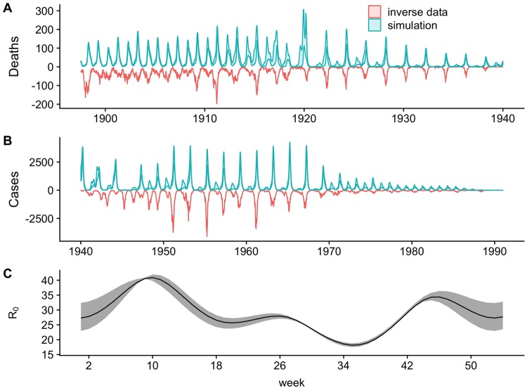
Fig 2. The comparison of predicted against observed weekly measles dynamics for London 1897–1991.
A) The 75% quantile fit (blue ribbon) from the forward-simulated fitted model against the inverted death data (red) from 1897 to 1940 while B) shows the fit against the case data from 1940 through 1990. Note that although different data sources are used, the simulation shown here is a fully forward prediction starting in 1897. C) The inferred annual transmission pattern, shown in solid black. The mean yearly transmission rate here is 29. Confidence intervals (95% calculated using the chi-square approximation of the likelihood ratio test) on the inferred seasonality pattern are shown in shaded gray.

