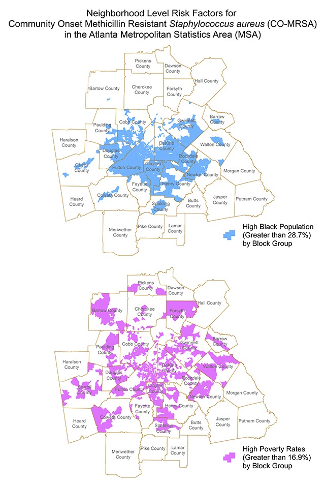
Figure 3.

Areas of ‘concentrated black population’ are shown in the map on the left and areas of ‘high’ poverty levels are shown on the right for the period of 2002–2004. These thematic maps depict the areas which correlate with new hot spots and consecutive hots spots of CO-MRSA during the period from 2002–2004. Similar hot spot maps were created for each time period for the nine years span of 2002–2010. (Reference for poverty rate: https://www.welfareinfo.org/poverty-rate/georgia/).
