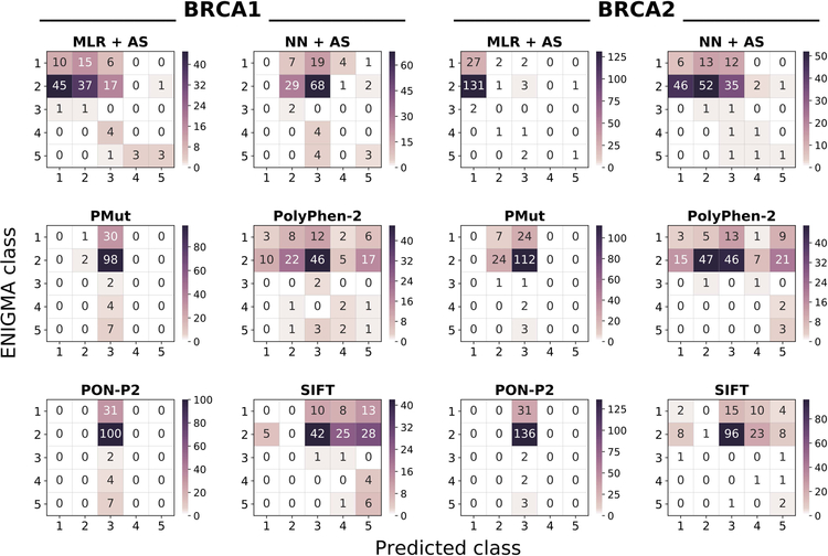
Figure 5. Heatmap of the predictor performances on the CAGI datasets.
Each heatmap represents the confusion matrix of a predictor. We provide six heatmaps per protein, two for our predictors (MLR+AS and NN+AS) and four for the general predictors (PolyPhen-2, PON-P2, PMut, and SIFT). In all the plots, the vertical and horizontal axes correspond to the observed (provided by CAGI organizers) and predicted IARC 5-tier classes, respectively. Diagonal and off-diagonal elements correspond to successful and failed predictions, respectively. NOTE: given the range differences in the predictions, each plot has its color scale.

