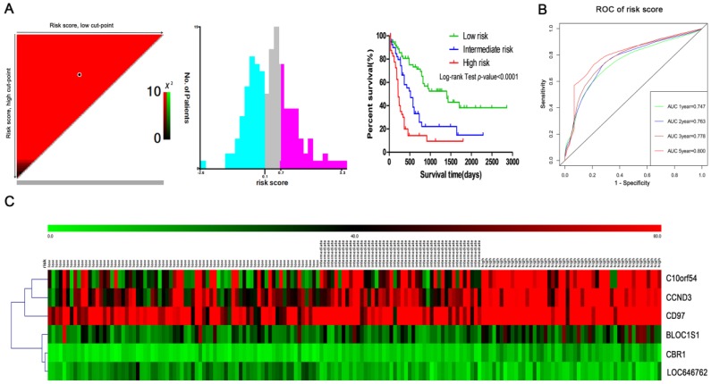
Figure 7.
Risk stratification in AML. (A) The plot shows the log-rank χ2 values produced by the two optimal cut-points, which divides the risk score into high, middle and low subsets. The red color of the cut-points is inversely related to survival, while the green color indicates a positive correlation. The optimal cut-point appears at the brightest pixel (red or green). (B) Time-dependent ROC curves for the risk score. Green, blue, brown and red indicate the sensitivity curve, and grey represents the identify line. (C) Heatmap for the lncRNA and mRNA expression levels among the three risk groups in all 167 adult AML patients.

