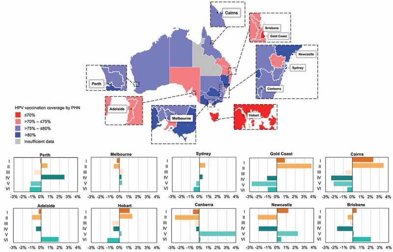
Figure 3.

Examples of topic exposure within individual cities in Australia by topic group (I-VI, inset), where bars represent the city-level difference in proportional exposure to each of the 6 topic groups relative to proportional exposure for all Australian Twitter users. The map illustrates differences in HPV vaccine coverage (population-weighted 3 dose completion aggregated for female and male adolescents) across the 31 Primary Health Networks (PHNs).
